Method
Three seconds to be understood.
Before judging a design, we open the site on a phone and count to three. Here are the three questions a home page must answer.
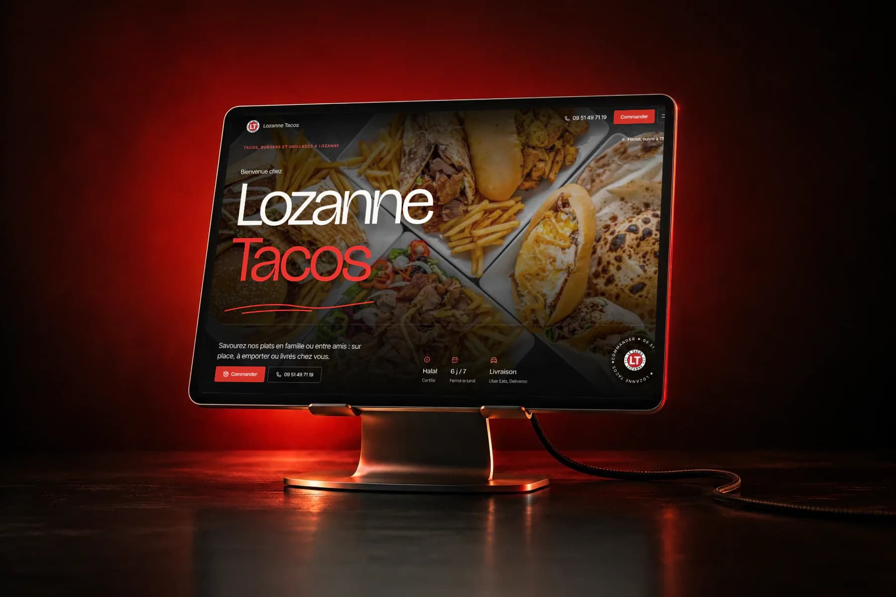
It is the first thing we do in front of a craftsman’s or a shop’s website. Phone in hand, home page, no scrolling. Three seconds, not one more. This number is not a statistic: it is our test, and you can run it yourself.
1. Who are you?
Your trade, in plain words. “Tailored solutions” says nothing to anyone. “Tiler”, “beauty institute” or “restaurant” are understood at once.
2. For whom, and where?
The place reassures. For example, “plumber in Lozanne” tells a neighbour they are in the right place. “Your trusted partner” tells them nothing.
3. What to do now?
A “Call” button visible without scrolling. On a phone, that is often the action that matters: a customer in a hurry wants to reach someone, not read a whole page.
Run the test tonight
- Open your site on your phone.
- Count to three, then hide the screen.
- Write down what you understood: the trade, the place, the action.
- Ask someone who does not know your business to do the same.
If one of the three answers is missing, that is where to start, before colours and animations.
Design comes after. First, three clear sentences.